
My Tutorials
In the code you can download I added comments that hopefully explain what's happening well enough.
Index
SCSS Guide
What is it and why should I use it
SCSS is like a different version of CSS that has some handy features:
You can set variables which can be helpful if you use the same colors in multiple places of your Style for example.
Some more info on Sass/Scss variables
CSS
.alert {
    border: 1px solid rgba(198, 83, 140, 0.88);
    }
Variable in SCSS
$base-color: #c6538c;
$border-dark: rgba($base-color, 0.88);

.alert {
    border: 1px solid $border-dark;
}
You can put brackets inside of brackets instead of writing things double which saves time and makes things much more structered.
(That's the main reason I use it)
CSS
.container {
font-family: "Franklin Gothic Medium", "Arial Narrow", Arial, sans-serif;
background: linear-gradient(rgba(249, 225, 188, 0.8), rgba(246, 231, 189, 0.8)), url(../../../about_me/diary/assets/deco/checkered1.jpg);
display: flex;
gap: 0.5%;
font-size: 1.8rem;
flex-wrap: wrap;
}
.container span {
flex: 1;
text-decoration: none;
outline: none;
text-align: center;
line-height: 1.5;
padding-top: 0.5em;
padding-bottom: 0.5em;
border: dotted rgb(150, 82, 45) 7px;
background: darkred;
color: white;
}
.container a {
flex: 1;
text-decoration: none;
outline: none;
text-align: center;
line-height: 1.5;
padding-top: 0.5em;
padding-bottom: 0.5em;
color: black;
}
.container a:link, .container a:visited, .container a:focus {
border-bottom: dotted rgb(150, 82, 45) 7px;
border-top: dotted rgb(150, 82, 45) 7px;
color: black;
}
.container a:hover, .container a:focus {
    color: #d5a571;
    border: dotted rgb(150, 82, 45) 5px;
    }
.container a:active {
    background: darkred;
    color: white;
    }
.container .active {
    border: solid rgb(96, 19, 58) 10px;
    }
same code in SCSS
.container {
font-family: 'Franklin Gothic Medium', 'Arial Narrow', Arial, sans-serif;
background: linear-gradient(rgba(249, 225, 188, 0.8),rgba(246, 231, 189, 0.8)), url(../../../about_me/diary/assets/deco/checkered1.jpg);
display: flex;
gap: 0.5%;
font-size: 1.8rem;
flex-wrap: wrap;


span {
    flex: 1;
    text-decoration: none;
    outline: none;
    text-align: center;
    line-height: 1.5;
    padding-top: 0.5em;
    padding-bottom: 0.5em;
    border: dotted rgb(150, 82, 45) 7px;
    background: darkred;
    color: white;
}

a {
    flex: 1;
    text-decoration: none;
    outline: none;
    text-align: center;
    line-height: 1.5;
    padding-top: 0.5em;
    padding-bottom: 0.5em;
    color: black;

    &:link,
    &:visited,
    &:focus {
        border-bottom: dotted rgb(150, 82, 45) 7px;
        border-top: dotted rgb(150, 82, 45) 7px;
        color: black;
    }
    &:hover,
    &:focus {
        color: #d5a571;
        border: dotted rgb(150, 82, 45) 5px;
    }
    &:active {
        background: darkred;
        color: white;
    }
    }
    .active {
    border: solid rgb(96, 19, 58) 10px;
}
}
Unfortunately you can't directly use SCSS the way you would with CSS by linking it to your HTML in a "stylesheet" but instead have to convert it into a CSS file first.
There is however an easy way for that, that just requires a little setting up first.
How to use SCSS
First you need to download node.js , this will be used to automatically convert and update your CSS file whenever you make changes to
your SCSS file.
Link to the download page for nodejs. Any version should do.
Afterwards you open your CMD window and type in:
npm install -g sass
After that you're good to go.
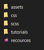
Now when you want to edit a SCSS file you create 2 folders within the same folder, one called "scss" and the other "css". Put your SCSS file in
the "scss" folder.
It should look something like this:
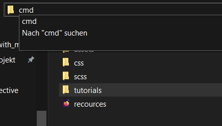
Next up you type in "cmd" in the folder directory to open the CMD window and then type:
sass -w scss:css
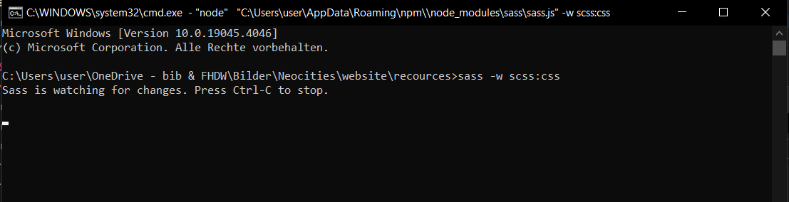
And that's it, all your changes in your SCSS will now automatically be updated to your CSS which you can connect to your HTML file. You can run the program for multiple SCSS files at the same time if you like. Just make sure to hit "ctrl+c" to stop the program each time once your done.
Popup window with CSS
This is what I used in my OCs section to make an NSFW Warning popup when clicking on some of the cencored art: See popup example on this website.
HTML
<body>

<input type="checkbox" id="click">
<label for="click" class="click-me"> <img src="../../../assets/cursor/still_image.png"> </label> <!-- this is whats visible first-->

<div class="content"> <!-- the pop up-->
    <div class="text">
    Here is a warning bla bla woof <br>

    </div>
<label for="click" id="temp">x</label> <!-- the ex button-->
</div>
<hr>
<p> click on the raccoons to see a different popup</p>


<!-- you need to change the id on the first input and the class on the div to add more pop up buttons like this
        (make sure to also add those in the css then)-->
<input type="checkbox" id="click2">
<label for="click2" class="click-me"> <img src="../../../assets/cursor/still_image.png"> </label>

<div class="content2">
    <div class="text">
    Here bla bla meow<br>

    </div>
    <label for="click2" id="temp">x</label>
</div>
</body>
CSS
.click-me
{
display:block;

cursor:pointer;
}
#click, #click2
{
display:none;
}
.click-me:hover
{
color: #0a5878;
border: 2px solid black;
}
.content, .content2
{
font-family: 'Gill Sans', 'Gill Sans MT', Calibri, 'Trebuchet MS', sans-serif;

position:absolute;
top:50%;
left:50%;
transform:translate(-50%,-50%);
visibility:hidden;
width: 330px;
height: auto;
background: #dde1e7;
padding: 30px 35px 40px;
box-sizing: border-box;
border-radius: 5px;
}
#temp
{
font-family: 'Gill Sans', 'Gill Sans MT', Calibri, 'Trebuchet MS', sans-serif;

position:absolute;
right:0px;
top:0px;
font-size:25px;
background: #dde1e7;
padding: 3px;
padding-left: 11px;
padding-right: 11px;
border-radius: 50%;
cursor:pointer;
}
#click:checked~.content, #click2:checked~.content2
{
opacity:1;
visibility:visible;
}
.text
{
font-size: 30px;
color: #000000;
font-weight: 600;
text-align: center;
letter-spacing: 2px;
}
Cursor Animation
Run Example for cursor animation
This is for the cursor hover animation you can find on this website.
Note this example uses SCSS but you can see the code you need in the SCSS or the CSS file.
Credit for cat animation used in the example: @artretro11 on pixilart
HTML
<body>
<main>
    <div class="hover-div repeating">
        Repeating
        <br>
        animation
    </div>
    <div class="hover-div once">
        Single
        <br>
        animation
    </div>
    <div>
        No
        <br>
        animation
    </div>
</main>
</body>
CSS
*{
margin:0;padding:0;box-sizing:border-box
}
main
{
width:100%;
height:100vh;
font-family:system-ui,-apple-system,BlinkMacSystemFont,"Segoe UI",Roboto,Oxygen,Ubuntu,Cantarell,"Open Sans","Helvetica Neue",sans-serif;
font-size:5rem;
font-weight:bolder;
color:#fff;
background-color:#242424;
display:flex;
flex-direction:row;
justify-content:stretch;
gap:10px;
padding:10px
}

main div
{
border:1px solid #d3d3d3;
border-radius:10px;
flex-grow:1;
display:flex;
justify-content:center;
align-items:center;
transition:all .3s
}

main div.hover-div:hover
{
background-color:#fff;color:#242424;flex-grow:2;animation:1s linear 0s cursoranimation
}
main div.hover-div:hover.repeating
{
animation-iteration-count:infinite
}

main div.hover-div:hover.once
{
animation-iteration-count:1;animation-fill-mode:forwards
}
/* the actual animation is defined here.
    if you want your animation to be centered with your cursor you simply put half the number of pixel in width and height after the image
    for example: cursor: url("../assets/cat/000.png") 64 64, auto; (if the picture is 128x 128 pixels like in this case) */
@keyframes cursoranimation
{
from{cursor:url("../assets/cat/000.png"),auto
}
16%
{
cursor:url("../assets/cat/001.png"),auto
}
32%
{
cursor:url("../assets/cat/002.png"),auto
}

48%
{
cursor:url("../assets/cat/003.png"),auto
}
64%
{
cursor:url("../assets/cat/004.png"),auto
}
82%
{
cursor:url("../assets/cat/005.png"),auto
}
to
{
cursor:url("../assets/cat/006.png"),auto
}}/*# sourceMappingURL=style.css.map */
Image pop up to full view using modals
I don't understand Javascript very well myself so I'll link to the page where I found the code:
Java and Css for pop up images tutorial
Code can be seen here in an example from my sfw art gallery
If you want this function for more than one picture in a page you need to make sure to apply new IDs and classes to the other pictures in the html, css and java.
HTML (Java script included)
<main>

<section class="canvas">
    <!-- Trigger the Modal -->
<img id="myImg" class="artwork" src="../../../assets/art/2024/1jan/vi_bg.jpg"
alt="vi from Arcane">
</section>

<section class="canvas">
    <!-- Trigger the Modal second image -->
<img id="myImg2" class="artwork" src="../../../assets/art/2024/1jan/vi.jpg"
alt="vi from Arcane">
</section>


<section class="canvas">
    <!-- Trigger the Modal third image-->
<img id="myImg3" class="artwork" src="../../../assets/art/2024/1jan/vi_bg_shirt.jpg"
alt="vi from Arcane">
</section>


<!-- The Modal -->
<div id="myModal" class="modal">

<!-- The Close Button -->
<span class="close">×</span>

<!-- Modal Content (The Image) -->
<img class="modal-content" id="img01">

<!-- Modal Caption (Image Text) -->
<div id="caption"></div>
</div>

<!-- The Modal 2-->
<div id="myModal2" class="modal2">

<!-- The Close Button -->
<span class="close2">×</span>

<!-- Modal Content (The Image) -->
<img class="modal-content2" id="img02">

<!-- Modal Caption (Image Text) -->
<div id="caption2"></div>
</div>

<!-- The Modal 3-->
<div id="myModal3" class="modal3">

<!-- The Close Button -->
<span class="close3">×</span>

<!-- Modal Content (The Image) -->
<img class="modal-content3" id="img03">

<!-- Modal Caption (Image Text) -->
<div id="caption2"></div>
</div>


</main>

<script>
// Get the modal
const modal = document.getElementById("myModal");
const modal2 = document.getElementById("myModal2");
const modal3 = document.getElementById("myModal3");

// Get the image and insert it inside the modal - use its "alt" text as a caption
const img = document.getElementById("myImg");
const img2 = document.getElementById("myImg2");
const img3 = document.getElementById("myImg3");
const modalImg = document.getElementById("img01");
const modalImg2 = document.getElementById("img02");
const modalImg3 = document.getElementById("img03");

img.onclick = ()=>{
modal.style.display = "block";
modalImg.src = img.src;

}
img2.onclick = ()=>{
modal2.style.display = "block";
modalImg2.src = img2.src;
}
img3.onclick = ()=>{
modal3.style.display = "block";
modalImg3.src = img3.src;
}


// Get the <span> element that closes the modal
const span = document.getElementsByClassName("close")[0];
const span2 = document.getElementsByClassName("close2")[0];
const span3 = document.getElementsByClassName("close3")[0];

// When the user clicks on <span> (x), close the modal
span.onclick = ()=> {
modal.style.display = "none";
}
span2.onclick = ()=> {
modal2.style.display = "none";
}
span3.onclick = ()=> {
modal3.style.display = "none";
}
</script>
CSS (HTML only had 3 images but this CSS also includes a possible 4th and 5th image)
/* Style the Image Used to Trigger the Modal */
#myImg, #myImg2, #myImg3, #myImg4, #myImg5 {
/* border-radius: 5px; */
cursor: pointer; /* switch with animation */
animation: 1s linear 0s cursoranimation;
animation-iteration-count: infinite;
transition: 0.3s;
}

#myImg:hover, #myImg2:hover, #myImg3:hover, #myImg4:hover, #myImg5:hover {filter: brightness(120%); }

/* The Modal (background) */
.modal, .modal2, .modal3, .modal4, .modal5 {
display: none; /* Hidden by default */
position: fixed; /* Stay in place */
z-index: 1; /* Sit on top */
padding-top: 0px; /* Location of the box */
left: 0;
top: 0;
width: 100%; /* Full width */
height: 100%; /* Full height */
overflow: auto; /* Enable scroll if needed */
background-color: rgb(0,0,0); /* Fallback color */
background-color: rgba(0,0,0,0.9); /* Black w/ opacity */
}

/* Modal Content (Image) */
.modal-content, .modal-content2, .modal-content3, .modal-content4, .modal-content5 {
margin: auto;
display: block;
max-width: 100vw;
max-height: 100vh;
object-fit: contain;
}


/* Add Animation - Zoom in the Modal */
.modal-content, #caption, .modal-content2, .modal-content3, .modal-content4, .modal-content5 #caption2 {
animation-name: zoom;
animation-duration: 0.6s;
}

@keyframes zoom {
from {transform:scale(0)}
to {transform:scale(1)}
}

/* The Close Button */
.close, .close2, .close3, .close4, .close5 {
position: absolute;
top: 15px;
right: 35px;
color: #f1f1f1;
font-size: 100px;
font-weight: bold;
transition: 0.3s;
}

.close:hover,
.close:focus,
.close2:hover,
.close2:focus,
.close3:hover,
.close3:focus,
.close4:hover,
.close4:focus,
.close5:hover,
.close5:focus {
color: #bbb;
text-decoration: none;
cursor: pointer;
}

/* 100% Image Width on Smaller Screens */
@media only screen and (max-width: 700px){
.modal-content, .modal-content2, .modal-content3, .modal-content4, .modal-content5 {
    width: 100%;
}
}